
Belgian artist Ben Heine seamlessly matches pencil sketches with real life settings to create images he calls 'Pencil Vs Camera'.

Pantone Color Institute, a company that has been trusted to draw on color trends in the world has issued the results of their research.They took the color pink trumpet flowers, or more popularly known as Honeysuckle.
Matching the color of the flower is pink as main color. From Genius Beauty, primary colors of red makes a person more vibrant, and active in welcoming the new year. Freshness thatemanated from these colors also give new energy to the wearer.

Still according to Pantone, both men and women would be veryinappropriate use Honeysuckle flower color. Due to wear this color,a person will be affected physically as well emotionally, so has thepower to ward off stress and all problems to be faced.
It is believed also, Honeysuckle color will dominate all areas of the fashion industry as well as cosmetics. Evidently, boutique H & Malso has adopted Honeysuckle color into its collection in 2011.
2010 - PANTONE 15-5519 Turquoise
2009 - PANTONE 14-0848 Mimosa
2008 - PANTONE 18-3943 Blue Iris
2007 - PANTONE 19-1557 Chili Pepper
2006 - PANTONE 13-1106 Sand Dollar
2005 - PANTONE 15-5217 Blue Turquoise
2004 - PANTONE 17-1456 Tigerlily
2003 - PANTONE 14-4811 Aqua Sky
2002 - PANTONE 19-1664 True Red
2001 - PANTONE 17-2031 Fuchsia Rose
2000 - PANTONE 15-4020 Cerulean


We tried to include visually appealing, interesting and creative design solutions just in case you are looking for some inspiration in designing the inside pages of a publication, be it a magazine, an annual report or a book. I hope everybody will find something interesting in this post.
Magazine Layout 01
Modern Design Magazine issue 13, July 2008

VIEW MAGAZINE LAYOUT
Magazine Layout 02
Dwell Magazine

VIEW MAGAZINE LAYOUT
Magazine Layout 03
Official U.S. Playstation Magazine

VIEW MAGAZINE LAYOUT
Magazine Layout 04
MM Magazine

VIEW MAGAZINE LAYOUT
Magazine Layout 05
Modern Design Magazine issue 13, July 2008

VIEW MAGAZINE LAYOUT
Magazine Layout 06
MAP Magazine

VIEW MAGAZINE LAYOUT
Magazine Layout 07
Magazine Spread

VIEW MAGAZINE LAYOUT
Magazine Layout 08
Life Lounge Magazine

VIEW MAGAZINE LAYOUT
Magazine Layout 09
Radical Magazine

VIEW MAGAZINE LAYOUT
Magazine Layout 10
Keeping on Track

VIEW MAGAZINE LAYOUT
Magazine Layout 11
Change in the Feather

VIEW MAGAZINE LAYOUT
Magazine Layout 12
Eyes on the Skies

VIEW MAGAZINE LAYOUT
Magazine Layout 13
Breaking New Ground

VIEW MAGAZINE LAYOUT
Magazine Layout 14
Berlin Fashion Week, Modern Design Magazine

VIEW MAGAZINE LAYOUT
Magazine Layout 15
The Carbon Connection

VIEW MAGAZINE LAYOUT
# 16
Modern Design Magazine, Kumi Yamashita, The Art of Shadows

VIEW MAGAZINE LAYOUT
#17
Between the ducks…

VIEW MAGAZINE LAYOUT
# 18
The Oklahoman Review, Issue 001

VIEW MAGAZINE LAYOUT
# 19
Three Sixty Magazine

VIEW MAGAZINE LAYOUT
# 20
Editorial Design

VIEW MAGAZINE LAYOUT

Logo design is a major factor that will be displayed when a product or company will be promoted in bulk. Choosing the right concept for a logo is necessary first point in designing a logo that fit with its mission, vision, and the credibility of a product or company.
Well, what should be a consideration when designing a logo that will be qualified?
1. Logo type
Text associated with logos, symbols, and a combination of both. Election Font Face appropriate course would be a determinant of the logo that will be created (the most appropriate example is Coca-Cola logo). So it is with symbols, it is definitely a fitting symbol of the company will make the image better again (example is the Nike swoosh). Any combination thereof, would give a different effect when compared to stand alone.

3. Finally, keep it simple
Simplify the logo you created. The design was too complex are feared to make attention become fragmented and unfocused. Use color wisely (do not wear too many colors). Simplicity logo will show your product or company is more authentic and professional.[]

Want to know how to design a logo like a professional and have all the resources you need in just one post? Then this is the post for you… Learn professional logo design in just 5 steps!
1. Learn What A Logo Is and What It Represents
Before you design a logo, you must understand what a logo is, what it represents and what it is supposed to do. A logo is not just a mark – a logo reflects a business’s commercial brand via the use of shape, fonts, colour, and / or images.
A logo is for inspiring trust, recognition and admiration for a company or product and it is our job as designers to create a logo that will do its job.
One must know what a logo is before continuing.
For further reading on what is a logo check out Wikipedia’s Definition.
2. Know The Principles of Effective Logo Design
1. A logo must be simple
A simple logo design allows for easy recognition and allows the logo to be versatile & memorable. Good logos feature something unexpected or unique without being overdrawn.
2. A logo must be memorable
Following closely behind the principle of simplicity, is that of memorability. An effective logo design should be memorable and this is achieved by having a simple, yet, appropriate logo.
3. A logo must be timeless
An effective logo should be timeless – that is, it will stand the test of time. Will the logo still be effective in 10, 20, 50 years?
4. A logo must be versatile
An effective logo should be able to work across a variety of mediums and applications. For this reason a logo should be designed in vector format, to ensure that it can be scaled to any size. The logo must work in just one colour too.
5. A logo must be appropriate
How you position the logo should be appropriate for its intended purpose. For example, if you are designing a a logo for children’s toys store, it would be appropriate to use a childish font & color scheme. This would not be so appropriate for a law firm.
For further reading on the rules and principles of great logo design I highly recommend to read the logo design tips from Logo Factory before continuing and also the article Why logo design does not cost $5.00. You may also wish to read How NOT To Design A Logo.
3. Learn Off Other’s Successes & Mistakes

Now you know what the rules of logo design are, you can distinguish the difference between a good and a bad logo… By knowing what other logos have succeeded and why they have succeeded gives a great insight into what makes a good logo.
For example, lets look at the classic Nike Swoosh. This logo was created by Caroline Davidson in 1971 for only $35 yet it still a strong, memorable logo, effective without colour and easily scalable. It is simple, fluid and fast and represents the wing in the famous statue of the Greek Goddess of victory, Nike – something perfect for a sporting apparel business. Nike is just one of many great logos, think about other famous brands that you know about and check out their logos – what makes them successful?
For more quality, lesser known logos I recommend checking out Logo Of The Day or going to your local book store or library and looking at a logo design book.
The Not So Successful Logos
We can also learn off logos that have not been as successful such as the ones in the above picture or these bad logo designs. As seen in that post linked, some logos can depict things that may have not always be noticeable to the designer (as in the middle logo above) or they could just be plain bad design, as in the logo to the right.
4. Establish Your Own Logo Design Process
Now that we know what a logo is, what the principles and rules of logo design are and what makes a successful logo we can now finally begin the design process. This it hardest part of the 5 steps and is its own topic in itself – Each person’s logo design process is different and experience usually is the key factor in creating your own logo design process however check out The Secret Logo Design Process Of Top Logo Designers for a better idea.
In short, a logo design process usually consists of
1. The Design Brief
2. Research & Brainstorming
3. Sketching
4. Prototyping & Conceptualising (See Step 5)
5. Send To Client For Review
6. Revise & Add Finishing Touches
7. Supply Files To Client and Give Customer Service
If you ever get stuck before or during your design process check out this great article on How To Boost Your Creativity.
5. Learn The Software and Complete The Logo

After you have got your design process sorted out, it is usually a good time to begin mastering your software (Adobe Illustrator is the industry standard) but remember you can’t design a logo by just hopping straight onto the computer… brainstorm and sketch first.
After you have got your initial ideas and sketches from brainstorming you can then usually jump onto the computer to start digitising your logo. After you have got a great concept(s) digitised you can send it to your client, get revisions, and eventually complete the logo and thus, you have successfully created a professional logo.
Do you have any other tips or suggestions on how to make a professional logo?

Synopsis
The battle between Heaven and Hell plunges into it's darkest hour as Angels and Demons, face their own extinction.
Necodemis Necrowpolis, has been haunted by demons since his childhood, forcing him to stay on the run from his nightmares that haunt his soul.
The Forces of Light and Darkness will stop at nothing to find Necodemis Necrowpolis, who can unlock the one weapon that can end the war.
Welcome to a future where Hell on Earth is infested with Dirty Science, Super Technology, Angels, Demons and Monsters.
In the battle between Good and Evil, Necodemis Necrowpolis, will be forced to do the Unforgivable.
Limited signed copies of The Unforgivable Vol.1 Devilution and special, signed, Tour posters will be a part of this Global Promotion. BrainMachine Comix continues its pursuit of promoting the fans and comic shops/book stores around the world with a Global book signing tour!
BE WARNED … book supplies and posters will be limited and exclusive to The Unforgivable 11:34 Tour locations.
The Unforgivable Vol.1 – Devilution - is a Global Collaboration in the form of a Graphic Novel Experience.
Published by BrainMachine Comix the project consists of Writer/Creator: Paskael Tyiska (United States), Artist: Alan Tham (Malaysia), Colorist: Ivanna Matilla (Argentina), Letterist: Randeep Grewal (United States), and Graphic Designer: M. R. Dodson (U.K), this global collaboration team comes together for this Super Sci-fi/ Horror.
11 cities in 34 days kicks off August 14, 2010 check link below for more information.
Dates are still being added and some dates are subject to change check www.TheUnforgivable.com for complete details.
TOUR LOCATIONS:
Bakersfield, CA - Manhattan Beach, CA - Los Angeles, CA, Seattle, WA - -
(please check website for updates and schedule)
www.TheUnforgivable.com

This post showcases 30 creative and beautifully designed inside pages of magazines. There are some elements that we give importance to when designing the inside pages of a magazine such as the typeface used for headlines, subheadlines and the body, the color palette or combination of colors used, the paragraph style, the folio, the styles applied to images. These are some of the elements that we set in our templates, master pages or style sheets when doing the layout in Magazine Layout 01
Modern Design Magazine issue 13, July 2008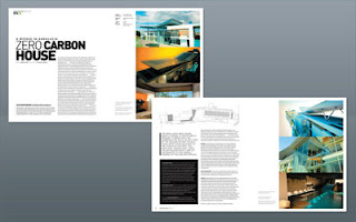
Magazine Layout 02
Dwell Magazine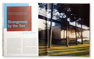
Magazine Layout 03
Official U.S. Playstation Magazine
Magazine Layout 04
MM Magazine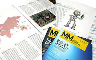
Magazine Layout 05
Modern Design Magazine issue 13, July 2008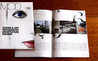
Magazine Layout 06
MAP Magazine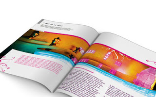
Magazine Layout 07
Magazine Spread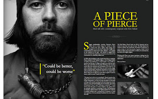
Magazine Layout 08
Life Lounge Magazine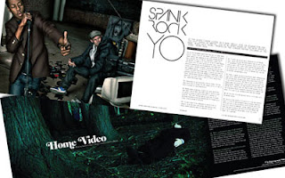
Magazine Layout 09
Radical Magazine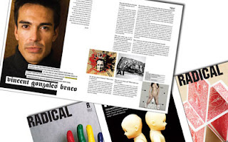
Magazine Layout 10
Keeping on Track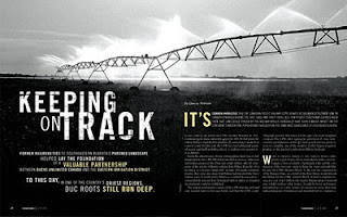
Magazine Layout 11
Change in the Feather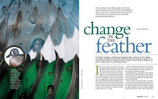
Magazine Layout 12
Eyes on the Skies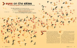
Magazine Layout 13
Breaking New Ground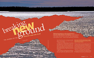
Magazine Layout 14
Berlin Fashion Week, Modern Design Magazine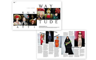
Magazine Layout 15
The Carbon Connection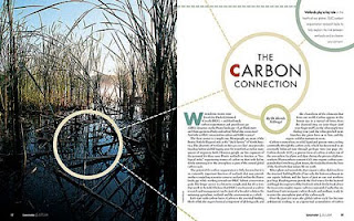
Magazine Layout 16
Modern Design Magazine, Kumi Yamashita, The Art of Shadows
Magazine Layout 17
Between the ducks…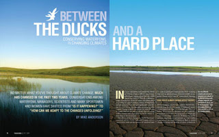
Magazine Layout 18
The Oklahoman Review, Issue 001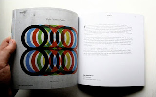
Magazine Layout 19
Three Sixty Magazine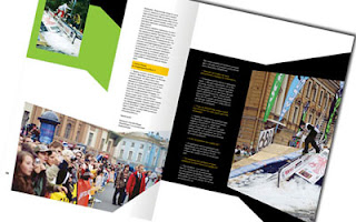
Magazine Layout 20
Editorial Design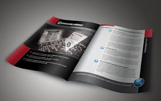
Source


