Showing posts with label Inspiration. Show all posts
Showing posts with label Inspiration. Show all posts

Belgian artist Ben Heine seamlessly matches pencil sketches with real life settings to create images he calls 'Pencil Vs Camera'.
Picture: Ben Heine
Source: Ttelegraph

Pantone Color Institute, a company that has been trusted to draw on color trends in the world has issued the results of their research.They took the color pink trumpet flowers, or more popularly known as Honeysuckle.
Matching the color of the flower is pink as main color. From Genius Beauty, primary colors of red makes a person more vibrant, and active in welcoming the new year. Freshness thatemanated from these colors also give new energy to the wearer.

Still according to Pantone, both men and women would be veryinappropriate use Honeysuckle flower color. Due to wear this color,a person will be affected physically as well emotionally, so has thepower to ward off stress and all problems to be faced.
It is believed also, Honeysuckle color will dominate all areas of the fashion industry as well as cosmetics. Evidently, boutique H & Malso has adopted Honeysuckle color into its collection in 2011.
2010 - PANTONE 15-5519 Turquoise
2009 - PANTONE 14-0848 Mimosa
2008 - PANTONE 18-3943 Blue Iris
2007 - PANTONE 19-1557 Chili Pepper
2006 - PANTONE 13-1106 Sand Dollar
2005 - PANTONE 15-5217 Blue Turquoise
2004 - PANTONE 17-1456 Tigerlily
2003 - PANTONE 14-4811 Aqua Sky
2002 - PANTONE 19-1664 True Red
2001 - PANTONE 17-2031 Fuchsia Rose
2000 - PANTONE 15-4020 Cerulean

Helvetica itself has become such a symbol for the world of graphic design that represents the clean design is minimalist and does not play a lot of color and image. The Helvetica font users are generally pretty good at word play, as well as his background that reinforces the meaning of the word or phrase that is also a lot ada.Teknik played by several manufacturers of t-shirts in several major cities in Indonesia. This design also continues to interior design, printing, and advertising medium.
Behind the reliability of Helvetica as a medium of images and words, there is another phenomenon that could be seen. Helvetica represent the taste of a community group that has the virtue of eating certain cultural products. According to Pierre Bourdieu, a matter of taste is essentially a class issue, and the problem of habitus. That is, only people from a particular group of people who are able to express his taste of a product.
At first, of course not everyone can design like Helvetica. Initially, all products that use Helvetica design can be digested only those who are able to capture the cultural code that he transmitted. It means simply, Helvetica exclusively belongs to those who have more capital to access the products that display this type of letter.Apple Computers (Macintosh), as licensees of this letter, the key to distinguishing between mainstream tastes and it tastes better.Because it is, Microsoft did not show it because the font does not have rights.
However, with the inclusion of this design into the market, through sales of T-shirts, bags and posters with the letter Helvetica, the code is more and more spread out and was captured by more and more people. Finally, the cultural message that more and more understood and no longer limited mobility in middle-class group, which is assumed to be most fond of Helvetica designs.
Format: OpenType (.OTF)
List of font:
Helvetica
Helvetica Black
Helvetica Black Oblique
Helvetica Bold
Helvetica Bold Oblique
Helvetica Compressed
Helvetica Condensed Black
Helvetica Condensed Black Oblique
Helvetica Condensed Bold
Helvetica Condensed Bold Oblique
Helvetica Condensed Light
Helvetica Condensed Light Oblique
Helvetica Condensed Oblique
Helvetica Condensed
Helvetica Extra Compressed
Helvetica Fraction
Helvetica Fraction Bold
Helvetica Light
Helvetica Light Oblique
Helvetica Narrow Bold Oblique
Helvetica Narrow Bold
Helvetica Narrow Oblique
Helvetica Narrow
Helvetica Oblique
Helvetica Ultra Compressed
Helvetica
Helvetica CE Bold
Helvetica CE Bold Oblique
Helvetica CE Cond
Helvetica CE Cond Bold
Helvetica CE Cond Bold Obl
Helvetica CE Cond Obl
Helvetica CE Narrow
Helvetica CE Narrow Bd Oblique
Helvetica CE Narrow Bold
Helvetica CE Narrow Oblique
Helvetica CE Oblique
Helvetica CE
Helvetica Cyr Bold
Helvetica Cyr BoldInclined
Helvetica Cyr Inclined
Helvetica Cyr Upright
Helvetica Inserat Roman
Helvetica InseratCyr Upright
HelveticaLTStd Blk
HelveticaLTStd Blk Obl
HelveticaLTStd Bold
HelveticaLTStd Bold Obl
HelveticaLTStd Light
HelveticaLTStd LightObl
HelveticaLTStd Obl
HelveticaLTStd Roman
Helvetica Neue Black
Helvetica Neue Black Cond
Helvetica Neue Black CondObl
Helvetica Neue Black Ext
Helvetica Neue BlackExtObl
Helvetica Neue BlackItalic
Helvetica Neue Bold
Helvetica Neue BoldCond
Helvetica Neue Bold CondObl
Helvetica Neue BoldExt
Helvetica Neue BoldExt Obl
Helvetica Neue BoldItalic
Helvetica Neue Bold Outline
Helvetica Neue Condensed
Helvetica Neue Condensed Obl
Helvetica Neue ExtBlackCond
Helvetica Neue ExtBlkCondObl
Helvetica Neue Extended
Helvetica Neue Extended Obl
Helvetica Neue Heavy
Helvetica Neue Heavy Cond
Helvetica Neue HeavyCondObl
Helvetica Neue HeavyExt
Helvetica Neue HeavyExtObl
Helvetica Neue HeavyItalic
Helvetica Neue Italic
Helvetica Neue Light
Helvetica Neue LightCond
Helvetica Neue LightCondObl
Helvetica Neue LightExt
Helvetica Neue LightExtObl
Helvetica Neue LightItalic
Helvetica Neue Medium
Helvetica Neue MediumCond
Helvetica Neue MediumCondObl
Helvetica Neue MediumExt
Helvetica Neue MediumExtObl
Helvetica Neue MediumItalic
Helvetica Neue Roman
Helvetica Neue Thin
Helvetica Neue ThinCond
Helvetica Neue ThinCondObl
Helvetica Neue ThinExt
Helvetica Neue ThinExtObl
Helvetica Neue ThinItalic
Helvetica Neue UltLigCondObl
Helvetica Neue UltLigExtObl
Helvetica Neue UltraLigCond
Helvetica Neue UltraLigExt
Helvetica Neue UltraLight
Helvetica Neue UltraLtItal
Helvetica Neue LTStd Bd
Helvetica Neue LTStd BdCn
Helvetica Neue LTStd BdCnO
Helvetica Neue LTStd BdEx
Helvetica Neue LTStd BdExO
Helvetica Neue LTStd BdIt
Helvetica Neue LTStd BdOu
Helvetica Neue LTStd Blk
Helvetica Neue LTStd BlkCn
Helvetica Neue LTStd BlkCnO
Helvetica Neue LTStd BlkEx
Helvetica Neue LTStd BlkExO
Helvetica Neue LTStd BlkIt
Helvetica Neue LTStd Cn
Helvetica Neue LTStd CnO
Helvetica Neue LTStd Ex
Helvetica Neue LTStd ExO
Helvetica Neue LTStd Hv
Helvetica Neue LTStd HvCn
Helvetica Neue LTStd HvCnO
Helvetica Neue LTStd HvEx
Helvetica Neue LTStd HvExO
Helvetica Neue LTStd HvIt
Helvetica Neue LTStd It
Helvetica Neue LTStd Lt
Helvetica Neue LTStd LtCn
Helvetica Neue LTStd LtCnO
Helvetica Neue LTStd LtEx
Helvetica Neue LTStd LtExO
Helvetica Neue LTStd LtIt
Helvetica Neue LTStd Md
Helvetica Neue LTStd MdCn
Helvetica Neue LTStd MdCnO
Helvetica Neue LTStd MdEx
Helvetica Neue LTStd MdExO
Helvetica Neue LTStd MdIt
Helvetica Neue LTStd Roman
Helvetica Neue LTStd Th
Helvetica Neue LTStd ThCn
Helvetica Neue LTStd ThCnO
Helvetica Neue LTStd ThEx
Helvetica Neue LTStd ThExO
Helvetica Neue LTStd ThIt
Helvetica Neue LTStd UltLt
Helvetica Neue LTStd UltLtCn
Helvetica Neue LTStd UltLtCnO
Helvetica Neue LTStd UltLtEx
Helvetica Neue LTStd UltLtExO
Helvetica Neue LTStd UltLtIt
Helvetica Neue LTStd XBlkCn
Helvetica Neue LTStd XBlkCnO
Helvetica Rounded BdCondObl
Helvetica Rounded Black
Helvetica Rounded Black Oblique
Helvetica Rounded Bold
Helvetica Rounded BoldCond
Helvetica Rounded BoldObl
Helvetica Rounded LTStd Bd
Helvetica Rounded LTStd BdCn
Helvetica Rounded LTStd BdCnO
Helvetica Rounded LTStd BdO
Helvetica Rounded LTStd Black
Helvetica Rounded LTStd BlkO
Enjoy it.

This post start-up offers free business card templates in Photoshop format. All you need to do is download the file, open it in Photoshop and just replace the text before sending them to a commercial printer. All business cards are sized 3.5 inches by 2 inches in CMYK with resolution of 300 dpi.
Below are the preview images of some of the business cards that you can download from this site. Most of them are from the Business Cards Deviantart.com pool some of them from designer of the World. To download the Photoshop templates, just click on the link provided below each business card preview image.


Thank for supported my blog. Enjoy it.
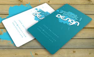
Splat Business Card By robbythedesigner | link download
By robbythedesigner | link download
By Metamag | Link download
By robbythedesigner | Link download
By Coreaux | Link download
Coffee cup business card by robbythedesigner | Link download
A Business Card with 2 alternative back sides. | Link download
Realistic Business Card | Link download
Elegant business card Link Download
Fashion Business Card | Link Download
Most people advertise by old concept their business cards to a paper or shoving them in a generic business card. However, you’re a visionary entrepreneur and such old-fashioned business card advertising methods just won’t do! Instead, you hunger for something unique that makes your business cards stand out from the rest, possibly something a little like this: Before Cool Laser Cut Business Card Designs
Let's start with a card that includes a magnetic strip, which simply plugs into a USB adapter which in turn syncs the new data with your Address book.

USB business card

A cheaper solution is to include a mobile phone readable 2D barcode on your card that allows people to scan in your data quickly and precisely.

A bit more creativity and a little less die-cut can also demonstrate well what your client does. In this case the dentist removing cavities.

You can use other more expensive materials if paper doesn't hold well enough. This one for example is made up of thin wood board.

Maybe not like this one.

The thing with die-cuts is they show on the other side of the card, which is usually an annoyance, but if you're smart you can make good use of it, like on this card made for a company Lion in Oil. This card reads both ways.

Laser cut card, this idea really pushes the limits of what can be achieved with paper

This concept card includes a ring with a proximity sensor and allows exchange of data when you shake hands with your new contact. This would give a whole new meaning to the handshake that now becomes obsolete among teens.

The message is very important if you're going to bear the extra cost of laser cutting or die-cutting.

This card for a manicurist is a little oversized, but it may even prove to be useful.

And if wood isn't enough for even more detail go for thin metal sheets.

I know this idea has been done before for photographers, but still like this one because it makes a good use of the die-cut on both sides.


Err... Allow me not to comment on this one.

Prefer twitter? Make sure you twitter the event of giving a card out immediately.

With all the new technology around us, do we still need to carry physical business cards around? Can't we just rely on people googling us? Well, it may work as long as you have a memorable set of keywords that surely resolve to your domain.

You can make the holes big enough so you can put your fingers through to complete the picture, like on this card for Yoga classes.

Here is a collection of cool laser cut business cards to inspire you. Most of them are from the Business Cards flickr pool some of them from Ads of the World.


Here are the video tutorials three easy steps to build a real wordpress themes for your friends, even for your clients.
In part 1, start from absolute scratch in Photoshop. In part 2 of this series, begin the HTML/CSS conversion of the Photoshop mockup
This tutorial should be used with many variants and additional techniques unique to the artist.
 Myriad Pro is the OpenType version of the original name Myriad font family. It first shipped in 2000, as Adobe moved towards the OpenType standard. Additional designers were Christopher Slye and Fred Brady. Compared to Myriad MM, it added support for Latin Extended, Greek, and Cyrillic characters, and oldstyle figures.
Myriad Pro originally included thirty fonts in three widths and five weights each, with complementary italics. A "semi-condensed" width was added several years later, expanding the family to forty fonts in four widths and five weights each, with complementary italics.
Myriad Pro Regular, Bold, Italic, and Bold Italic are bundled with Adobe Reader 7.0 and 8.x. In Adobe Reader 9 they are included but not installed in the system fonts directory.[]
Download Myriad Pro Complete Family Pack here for your style design.
Other Download Helvetica Complete Family Pack Font Here
This post showcases 30 creative and beautifully designed inside pages of magazines. There are some elements that we give importance to when designing the inside pages of a magazine such as the typeface used for headlines, subheadlines and the body, the color palette or combination of colors used, the paragraph style, the folio, the styles applied to images. These are some of the elements that we set in our templates, master pages or style sheets when doing the layout in Adobe Indesign or other desktop publishing programs in order to create a coherent look for a particular publication or magazine from cover to cover.
We tried to include visually appealing, interesting and creative design solutions just in case you are looking for some inspiration in designing the inside pages of a publication, be it a magazine, an annual report or a book. I hope everybody will find something interesting in this post.
Magazine Layout 01
Modern Design Magazine issue 13, July 2008

VIEW MAGAZINE LAYOUT
Magazine Layout 02
Dwell Magazine

VIEW MAGAZINE LAYOUT
Magazine Layout 03
Official U.S. Playstation Magazine

VIEW MAGAZINE LAYOUT
Magazine Layout 04
MM Magazine

VIEW MAGAZINE LAYOUT
Magazine Layout 05
Modern Design Magazine issue 13, July 2008

VIEW MAGAZINE LAYOUT
Magazine Layout 06
MAP Magazine

VIEW MAGAZINE LAYOUT
Magazine Layout 07
Magazine Spread

VIEW MAGAZINE LAYOUT
Magazine Layout 08
Life Lounge Magazine

VIEW MAGAZINE LAYOUT
Magazine Layout 09
Radical Magazine

VIEW MAGAZINE LAYOUT
Magazine Layout 10
Keeping on Track

VIEW MAGAZINE LAYOUT
Magazine Layout 11
Change in the Feather

VIEW MAGAZINE LAYOUT
Magazine Layout 12
Eyes on the Skies

VIEW MAGAZINE LAYOUT
Magazine Layout 13
Breaking New Ground

VIEW MAGAZINE LAYOUT
Magazine Layout 14
Berlin Fashion Week, Modern Design Magazine

VIEW MAGAZINE LAYOUT
Magazine Layout 15
The Carbon Connection

VIEW MAGAZINE LAYOUT
# 16
Modern Design Magazine, Kumi Yamashita, The Art of Shadows

VIEW MAGAZINE LAYOUT
#17
Between the ducks…

VIEW MAGAZINE LAYOUT
# 18
The Oklahoman Review, Issue 001

VIEW MAGAZINE LAYOUT
# 19
Three Sixty Magazine

VIEW MAGAZINE LAYOUT
# 20
Editorial Design

VIEW MAGAZINE LAYOUT
We tried to include visually appealing, interesting and creative design solutions just in case you are looking for some inspiration in designing the inside pages of a publication, be it a magazine, an annual report or a book. I hope everybody will find something interesting in this post.
Magazine Layout 01
Modern Design Magazine issue 13, July 2008
VIEW MAGAZINE LAYOUT
Magazine Layout 02
Dwell Magazine
VIEW MAGAZINE LAYOUT
Magazine Layout 03
Official U.S. Playstation Magazine
VIEW MAGAZINE LAYOUT
Magazine Layout 04
MM Magazine
VIEW MAGAZINE LAYOUT
Magazine Layout 05
Modern Design Magazine issue 13, July 2008
VIEW MAGAZINE LAYOUT
Magazine Layout 06
MAP Magazine
VIEW MAGAZINE LAYOUT
Magazine Layout 07
Magazine Spread
VIEW MAGAZINE LAYOUT
Magazine Layout 08
Life Lounge Magazine
VIEW MAGAZINE LAYOUT
Magazine Layout 09
Radical Magazine
VIEW MAGAZINE LAYOUT
Magazine Layout 10
Keeping on Track
VIEW MAGAZINE LAYOUT
Magazine Layout 11
Change in the Feather
VIEW MAGAZINE LAYOUT
Magazine Layout 12
Eyes on the Skies
VIEW MAGAZINE LAYOUT
Magazine Layout 13
Breaking New Ground
VIEW MAGAZINE LAYOUT
Magazine Layout 14
Berlin Fashion Week, Modern Design Magazine
VIEW MAGAZINE LAYOUT
Magazine Layout 15
The Carbon Connection
VIEW MAGAZINE LAYOUT
# 16
Modern Design Magazine, Kumi Yamashita, The Art of Shadows
VIEW MAGAZINE LAYOUT
#17
Between the ducks…
VIEW MAGAZINE LAYOUT
# 18
The Oklahoman Review, Issue 001
VIEW MAGAZINE LAYOUT
# 19
Three Sixty Magazine
VIEW MAGAZINE LAYOUT
# 20
Editorial Design
VIEW MAGAZINE LAYOUT
Subscribe to:
Posts (Atom)


